01. Overview
The Brief.
Lisboa Bar is a historic venue built between 1942 and 1946 on the former Pátio do Palácio do Duque do Cadaval.Nestled between Calçada do Carmo, the iconic Escadinhas do Duque, and Rossio Station, it carries decades of cultural memory, including its presence in images of the Carnation Revolution.
Despite this rich heritage, the brand's visual identity had aged. The existing logo, a classical crest with laurel leaves, no longer reflected the bar's energy or its connection to the city's streets. The challenge: modernise the identity without erasing its soul.
The problem
An outdated crest-based logo that felt generic and disconnected from the bar's unique urban setting and revolutionary legacy.
The goal
A fresh, memorable identity grounded in place, bold in execution, instantly legible at any scale, and built to last.
"
The staircase shape wasn't designed, it was discovered.
It was already there, in the architecture, in the topography, in the way the building sits on the hillside.
It was already there, in the architecture, in the topography, in the way the building sits on the hillside.
02. Logo System
The mark
and its variations.
and its variations.
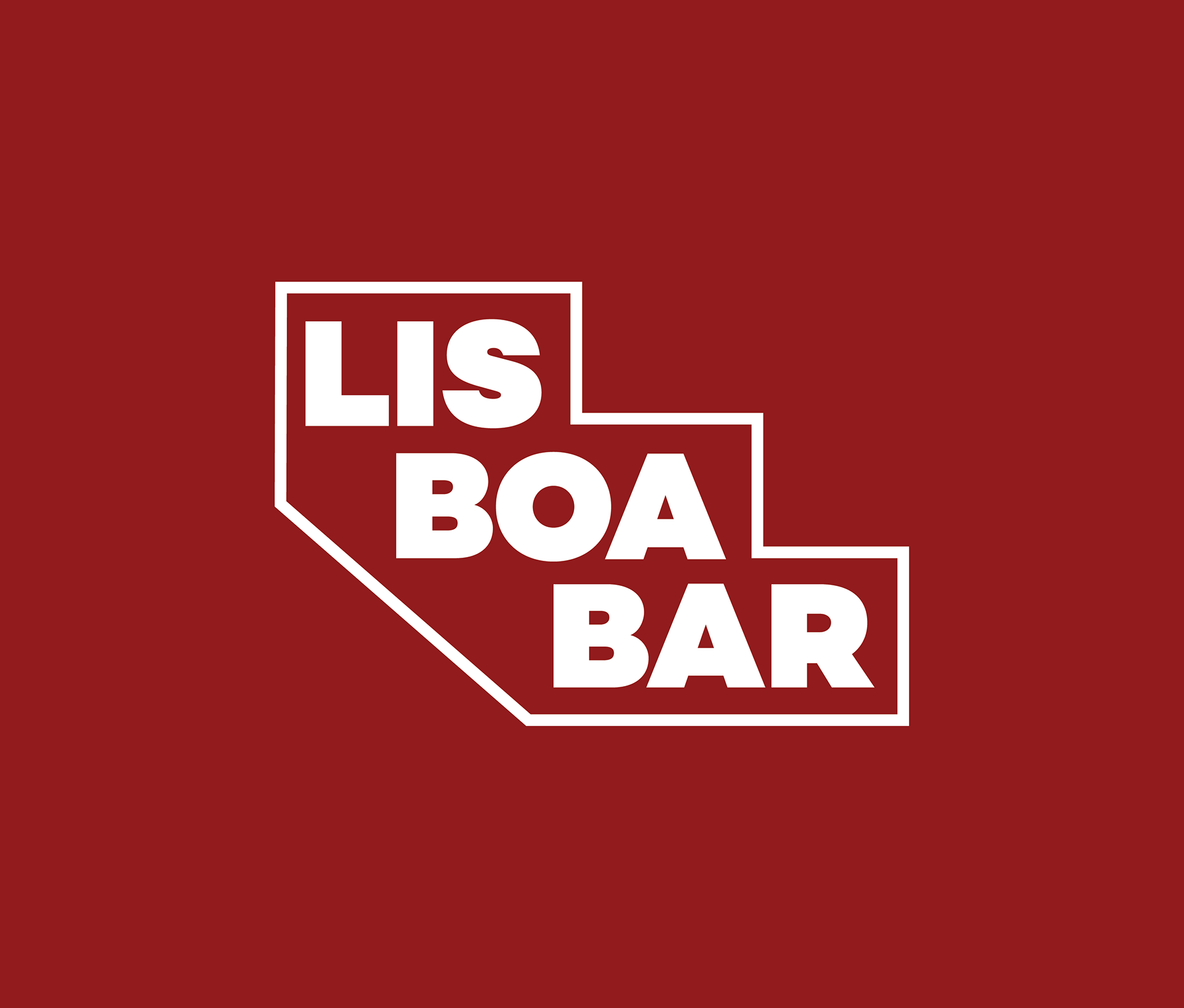
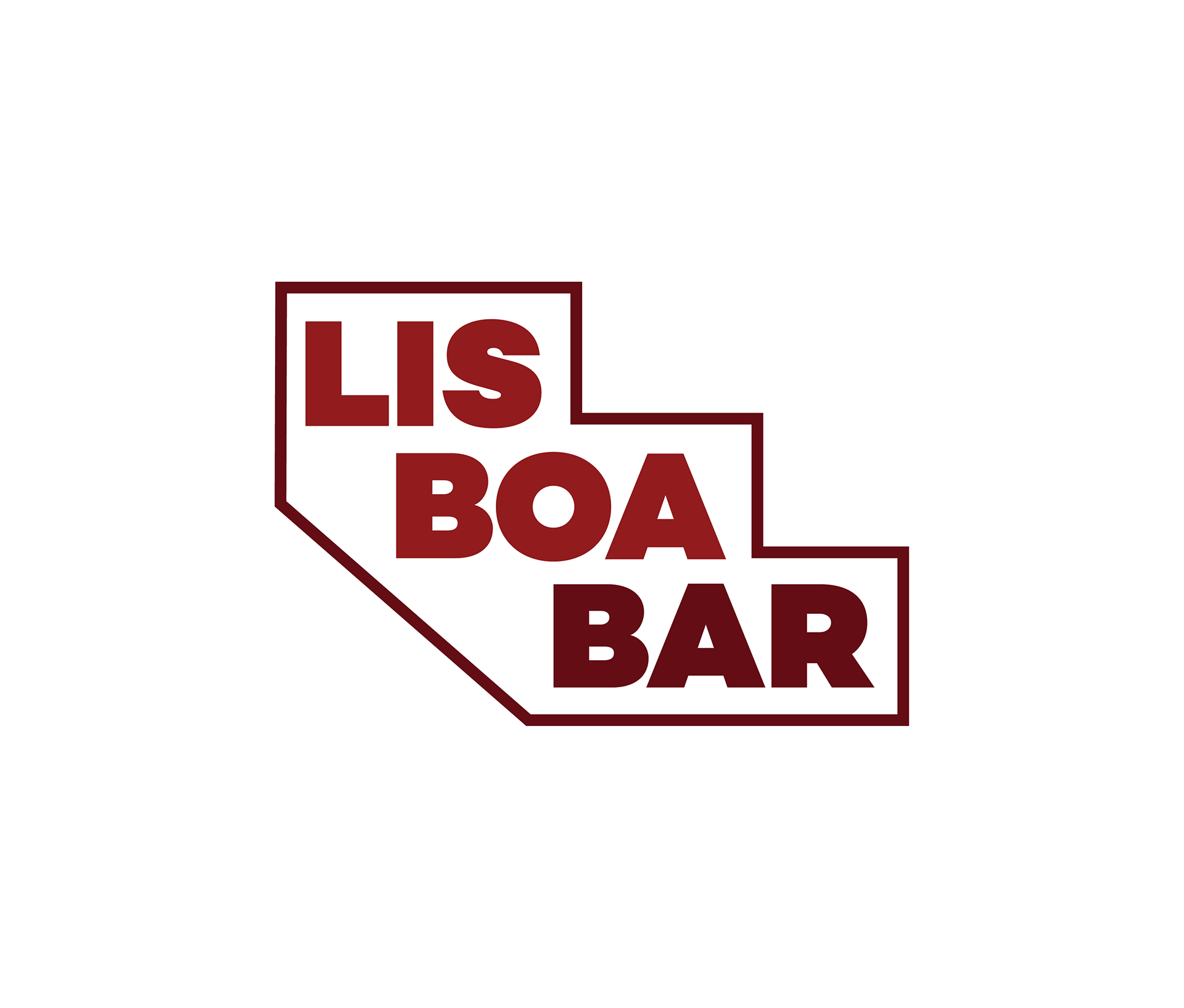
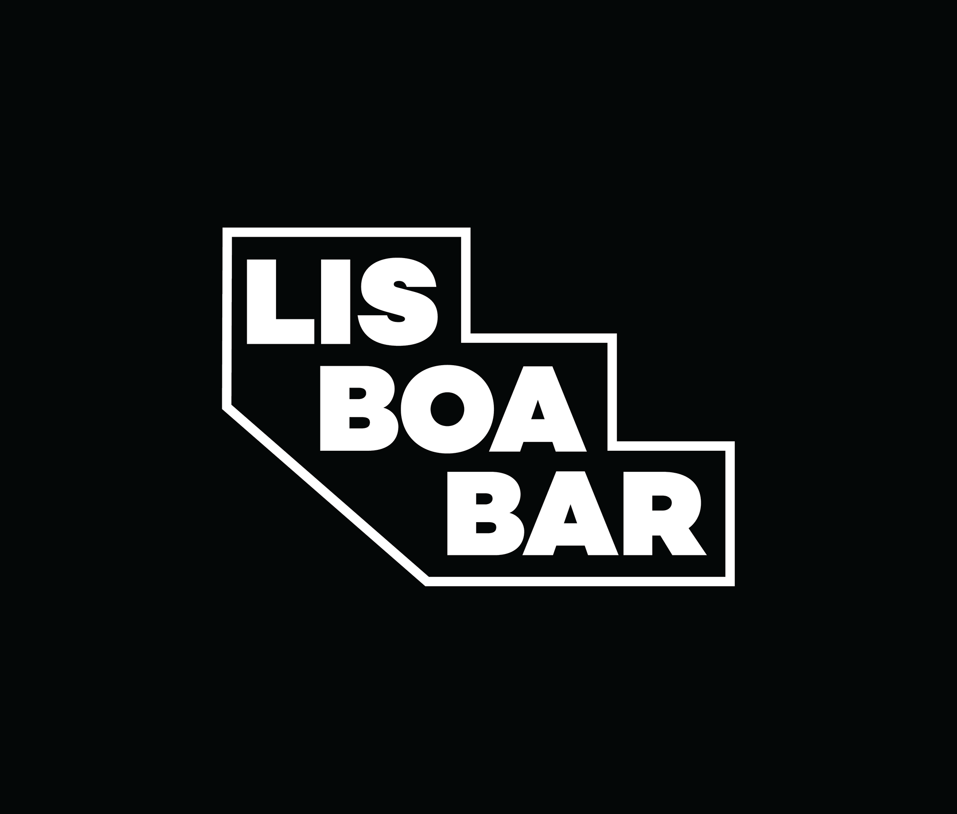
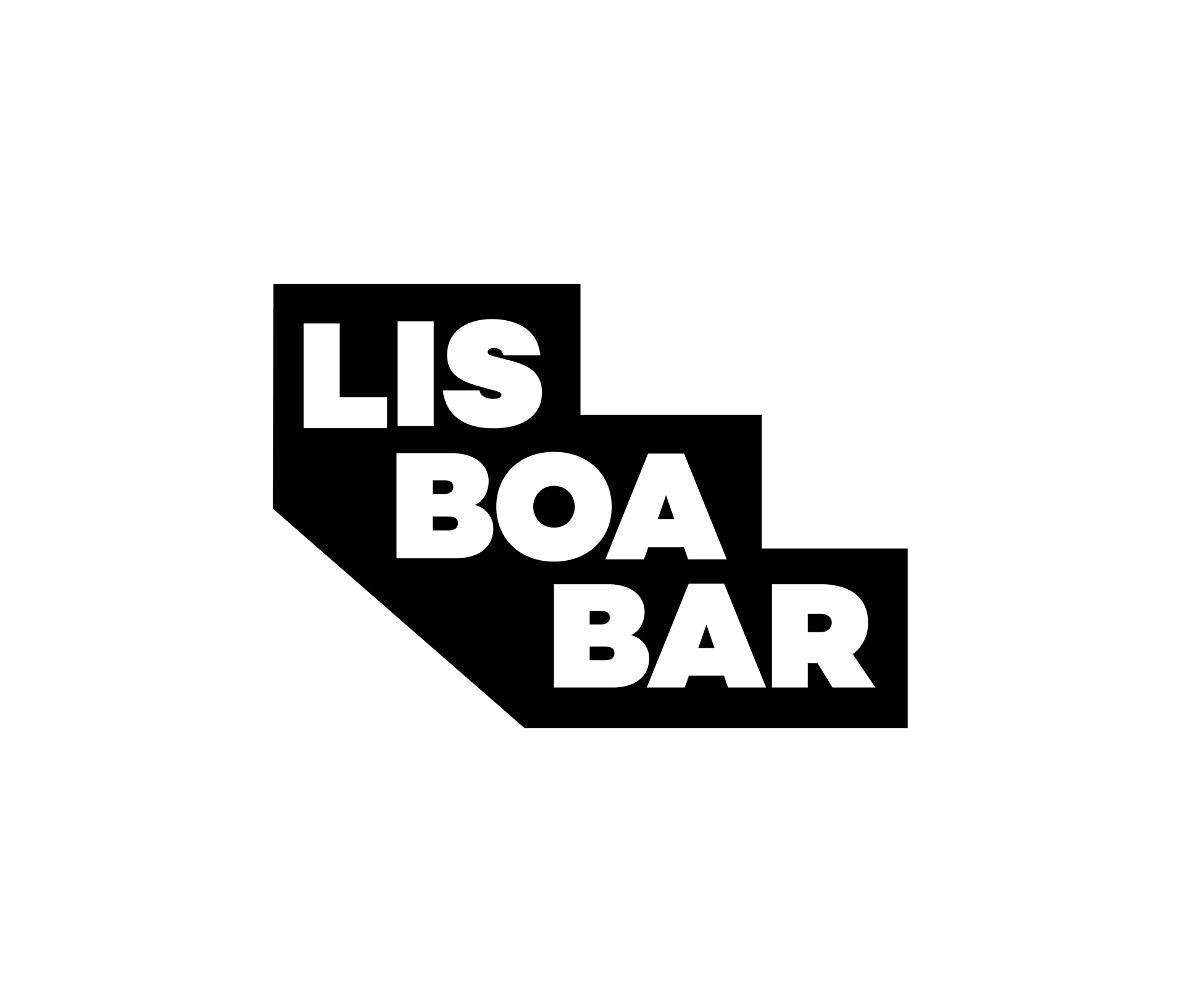
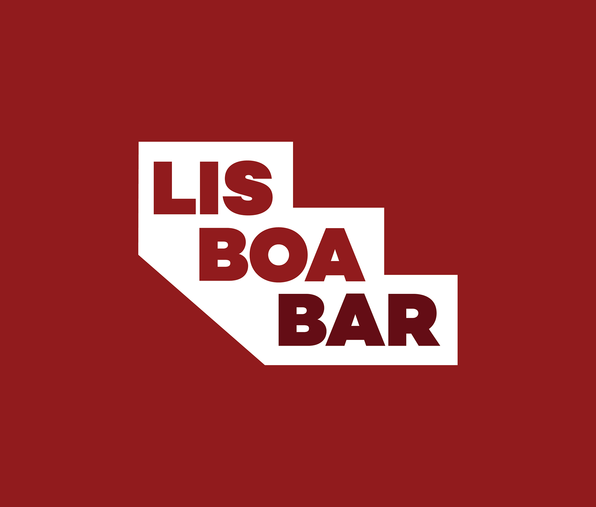
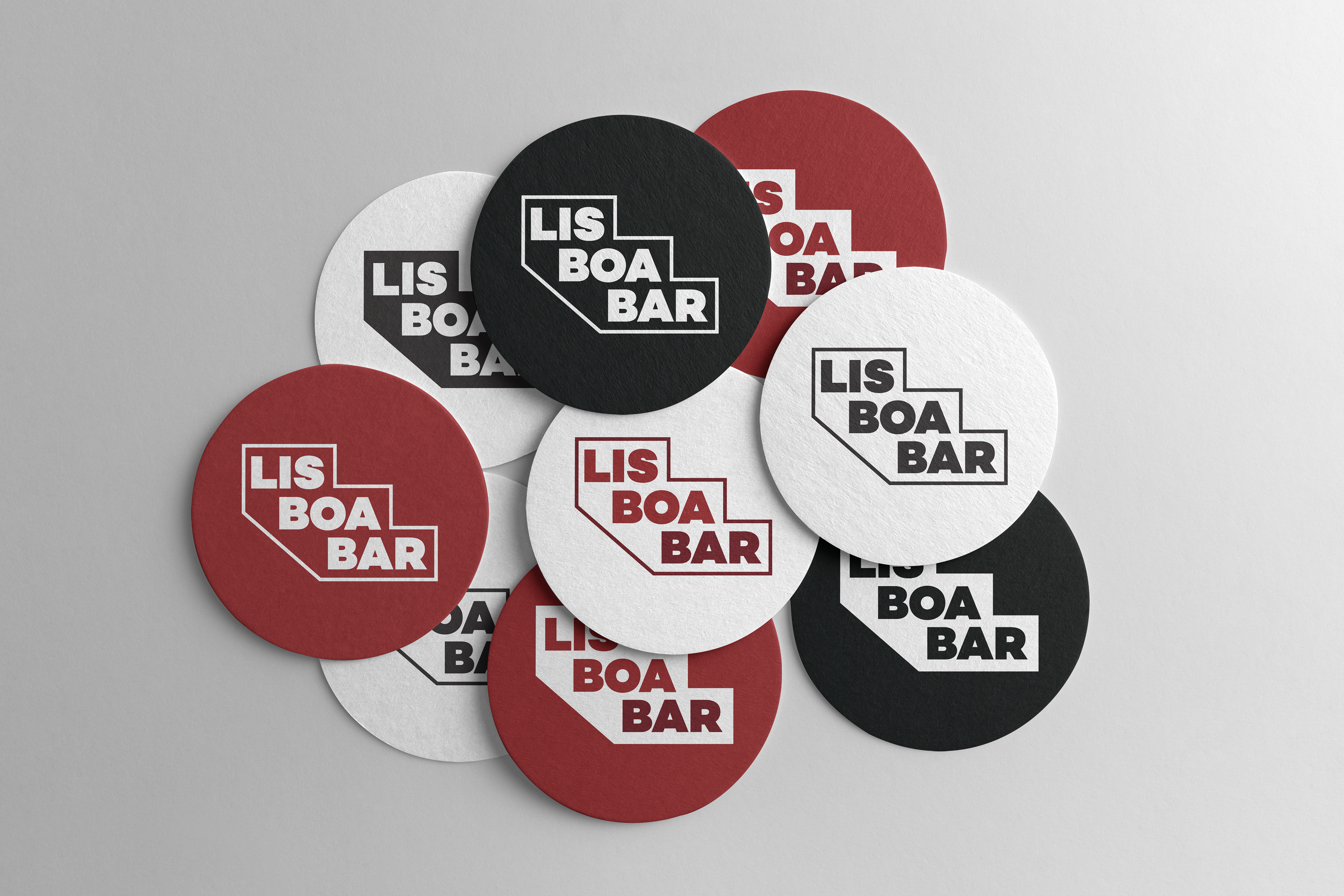
The stepped silhouette translates across seven variations, outlined, filled, monochrome, and typographic,
ensuring the identity holds up on every surface and background.
ensuring the identity holds up on every surface and background.

03. Concept
The staircase
as logo.
as logo.
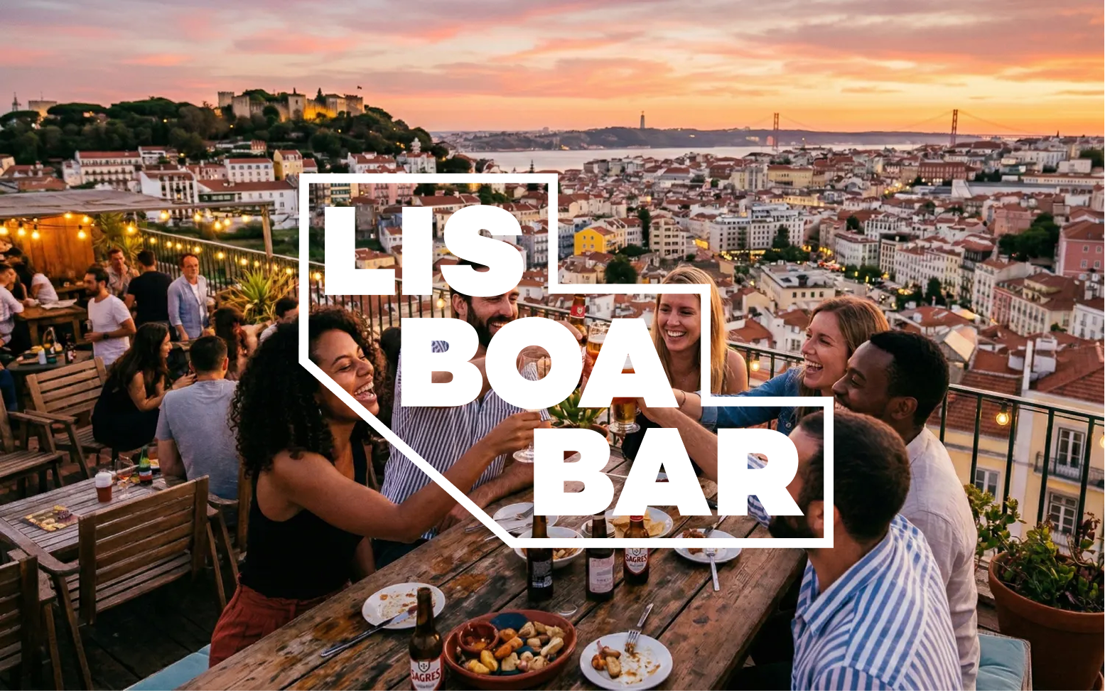
Research began on the ground. A field visit to the bar and surrounding streets, the Escadinhas do Duque with their 240 steps, the deep crimson-red of the building's façade, made it clear that the identity already existed in the city itself.
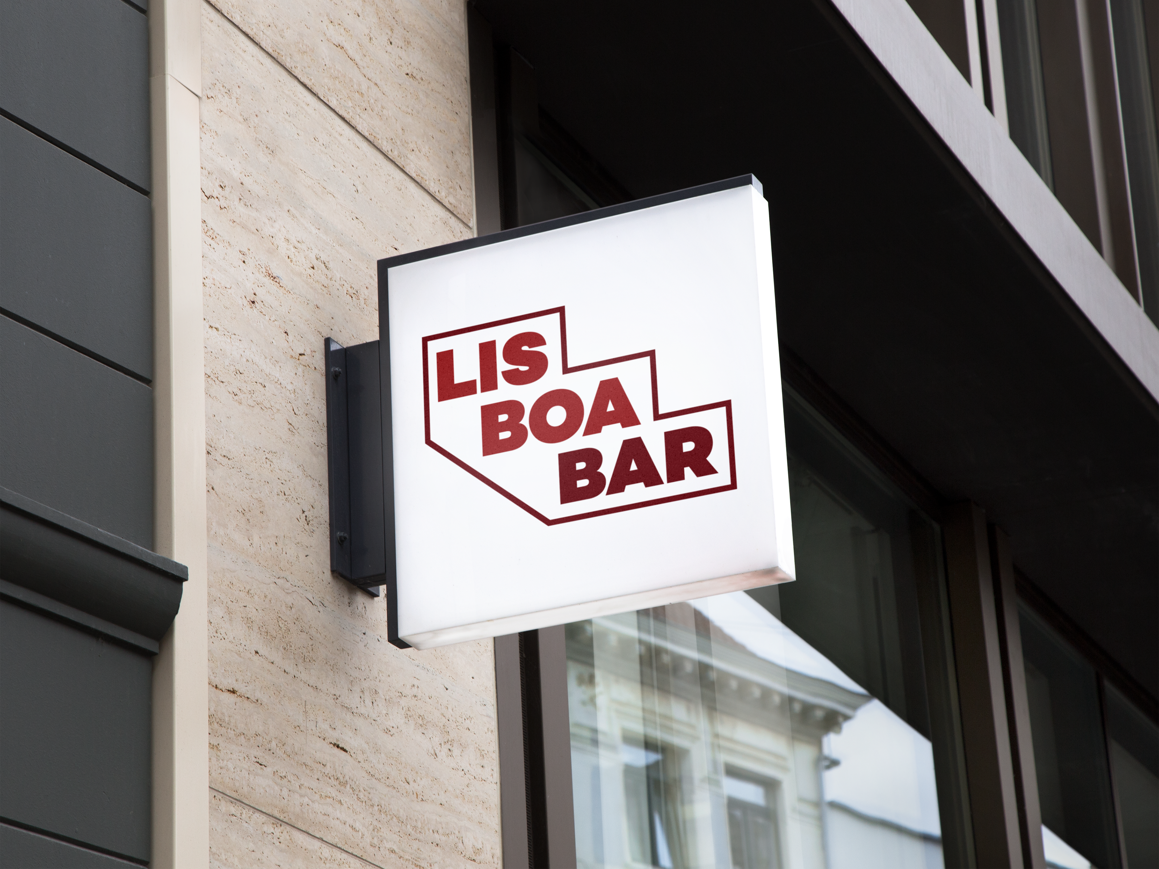
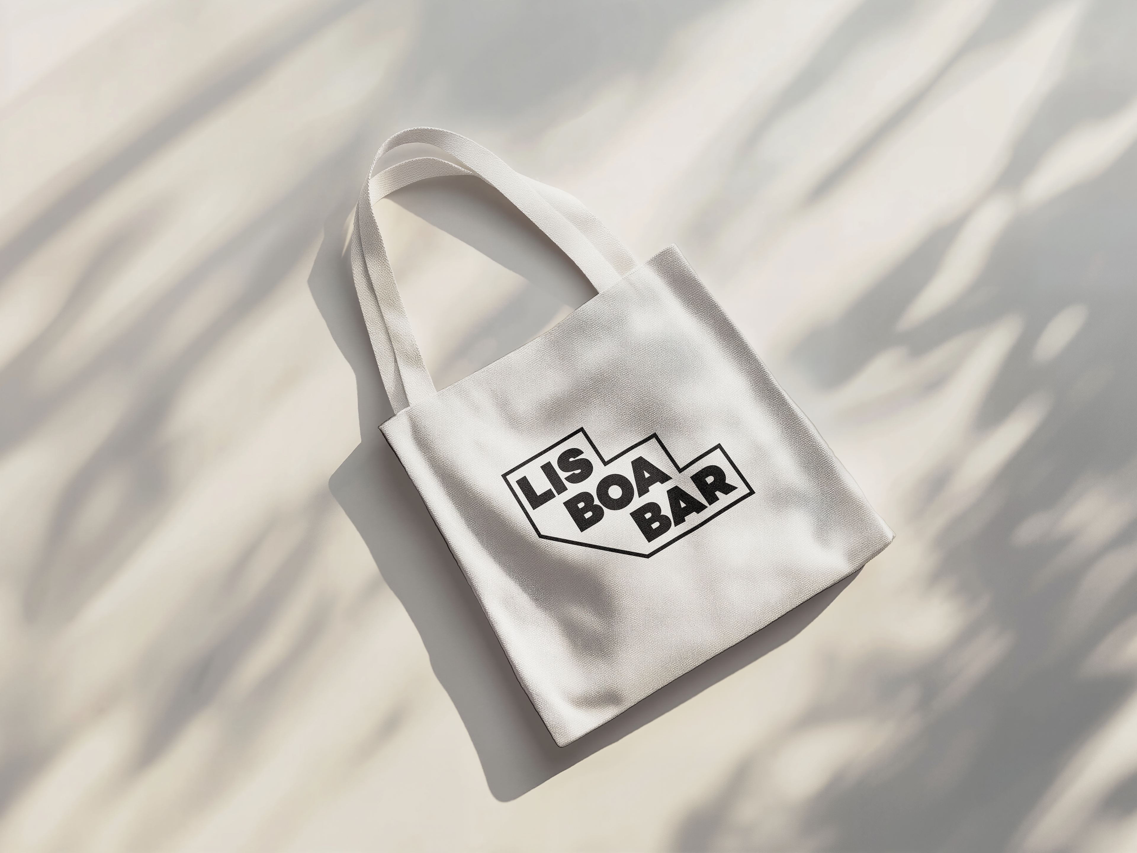
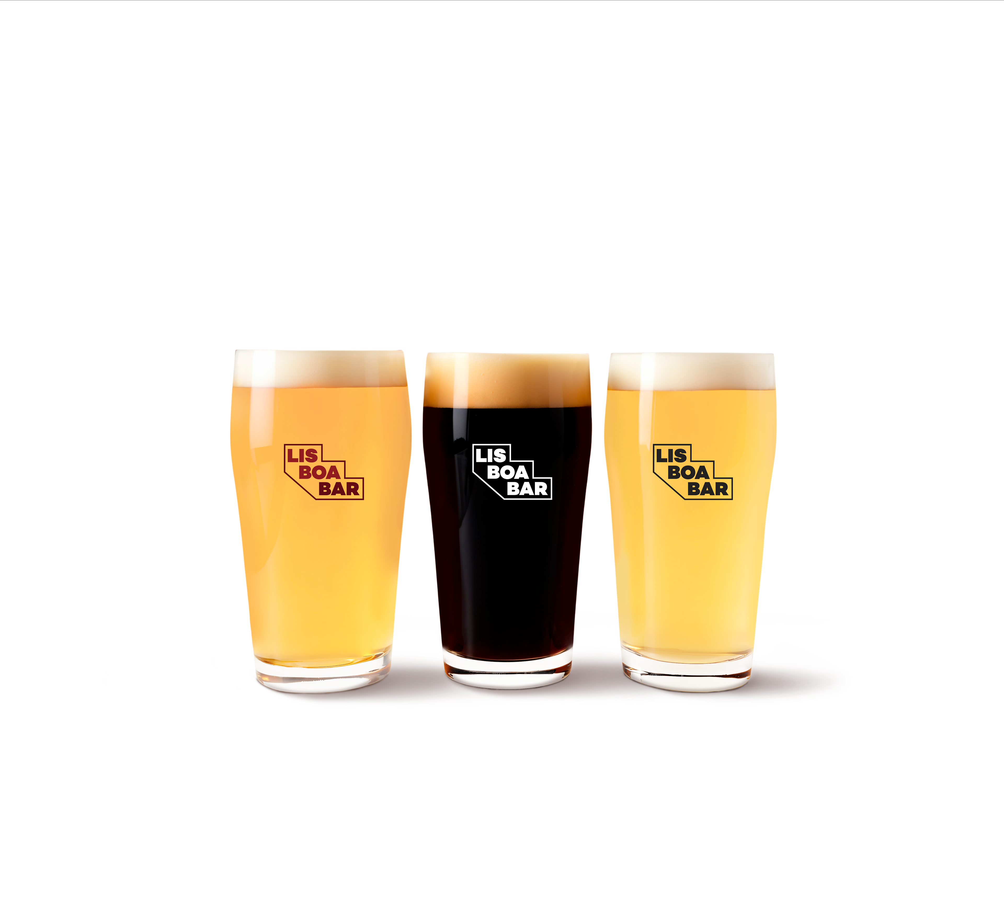
The new logomark takes its form directly from Lisbon's topography. The stepped silhouette references the staircase and the building's façade profile. The wordmark breaks "LIS / BOA / BAR" across three lines, stacking naturally inside the stepped container. A condensed, bold typeface gives the mark strength and legibility at any scale.
Colour palette — drawn from the façade
Colour palette — drawn from the façade

04. Process
How it came
together.
together.
01
Field Research
Visited the bar and surrounding streets. Photographed the building, the staircase, and the neighbourhood to understand the visual language of the place first-hand.
02
Historical Research
Reviewed archival images of the bar's history, including its appearance in documentation of the Carnation Revolution, to understand the brand's symbolic depth.
03
Conceptual development
Translated the staircase silhouette into a geometric logomark in Figma and Adobe Illustrator. Explored multiple type treatments before settling on the stacked, condensed wordmark.
04
Colour system
Derived the colour palette from the building's own façade, a spectrum of deep reds that serve as both a brand colour and a wayfinding signal in the urban landscape.
05
Colour system
Derived the colour palette from the building's own façade, a spectrum of deep reds that serve as both a brand colour and a wayfinding signal in the urban landscape.
05. Applications
The identity
in use.
in use.
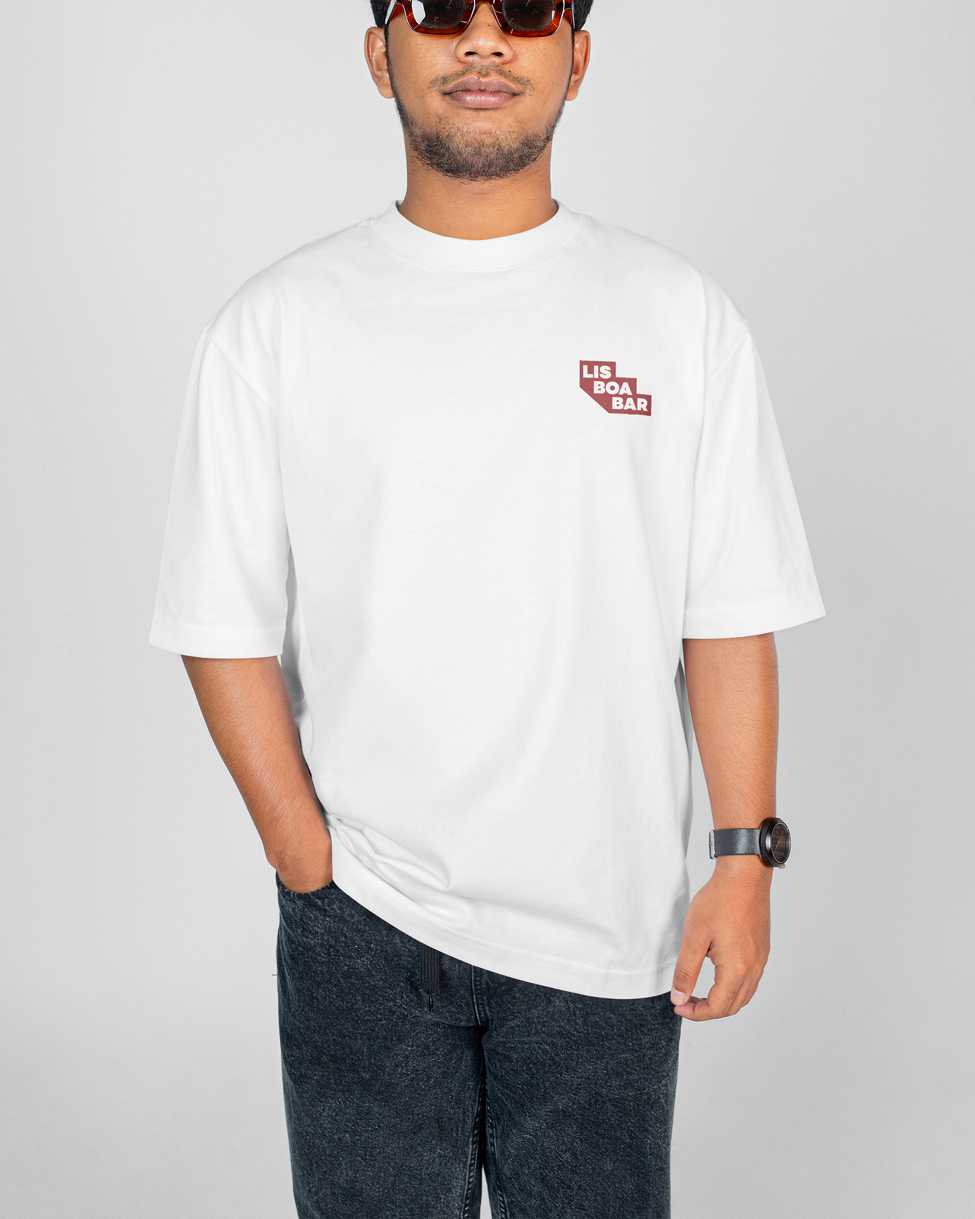
The stepped logomark proves its versatility across every touchpoint, from crimson on a white coaster to monochrome on a tote bag, the mark holds at any scale.
Instagram: @lisboa_bar