00. A Designer Who Trains
This project was personal.
I practice Jiu-Jitsu. That single fact changed everything about how I approached this brand.
When I train, my mind becomes still, there is only the mat, the movement, the learning.
A kind of meditation in motion. I feel confident. Strong. Disciplined. I feel safe, and I know I can defend myself if I ever need to.
A kind of meditation in motion. I feel confident. Strong. Disciplined. I feel safe, and I know I can defend myself if I ever need to.
That experience, that specific feeling of being a woman on the mat, is exactly what ONNA needed to embody.
Not from the outside looking in, but from the inside out.
Not from the outside looking in, but from the inside out.
"Having a kimono called ONNA means one more step has been taken towards protecting women, not just outside the tatame, but inside it."
Mind like the mat
On the tatame, the mind empties. There is no noise, only learning, presence, and the discipline of the body. This meditative quality shaped the brand's restraint and focus.
Strength without armour
Jiu-Jitsu teaches that real strength doesn't need to perform itself. ONNA's identity reflects this, bold without shouting, powerful without aggression.
Made for women, by design
Most sports brands design for women as an afterthought. Designing ONNA as a practitioner meant understanding what it actually feels like to need a kimono that fits your body and your identity.
Protection on and off the mat
This brand is about more than sport. It's about the confidence that training builds, and the signal that wearing ONNA sends: that you are someone who knows how to take care of herself.
01. The Brief
Built for everyone.
Claimed by no one.
Claimed by no one.
The client arrived with a clear gap to fill: Jiu-Jitsu builds real, functional strength in women, physical and mental.
Yet no Portuguese brand had ever spoken directly to that woman. The market treated her as secondary, if it acknowledged her at all.
Yet no Portuguese brand had ever spoken directly to that woman. The market treated her as secondary, if it acknowledged her at all.
The challenge was to create a visual identity that represented the feminine universe in Jiu-Jitsu without softening it.
No pastels. No apologies. A brand that felt like armour and wore like one too.
No pastels. No apologies. A brand that felt like armour and wore like one too.
"Every ONNA kimono is a suit of armour.
Cut to embrace real shapes. Built to last."
Cut to embrace real shapes. Built to last."
02. Process
Brief to delivery.
Built on intention.
Built on intention.
The process was direct and deeply collaborative.
My own experience as a practitioner shortened the distance between brief and solution.
I didn't need to imagine the audience. I am part of it.
01 Discovery & Brief
Deep dive into the client's vision, target audience, and the world of Jiu-Jitsu.
As a practitioner myself, I brought lived knowledge to the brief, understanding both the sport's Japanese roots and what it means to be a woman training in it.
02 Research & Inspiration
Explored the Onna-Musha, the samurai warrior women of feudal Japan, as the brand's founding myth.
Women who took up arms when the world told them to stay silent. This became the emotional and visual spine of the identity.
Explored the Onna-Musha, the samurai warrior women of feudal Japan, as the brand's founding myth.
Women who took up arms when the world told them to stay silent. This became the emotional and visual spine of the identity.
03 Identity Design
Developed the logo, colour palette, and typographic system.
Multiple rounds of iteration with the client to refine the mark and ensure it translated powerfully across all touchpoints, from a small label to a building-side sign.
Developed the logo, colour palette, and typographic system.
Multiple rounds of iteration with the client to refine the mark and ensure it translated powerfully across all touchpoints, from a small label to a building-side sign.
04 Brand Deck & Mockups
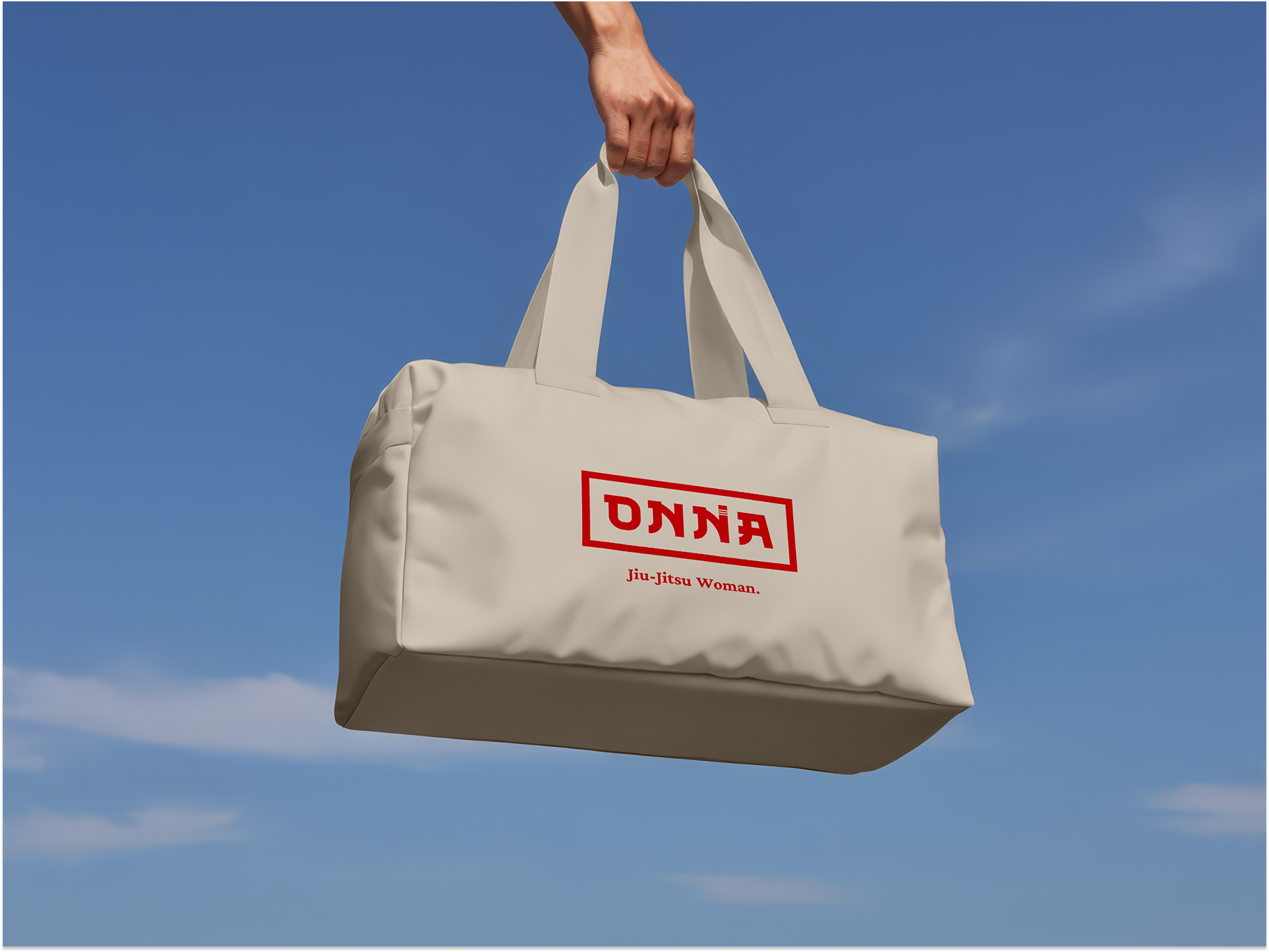
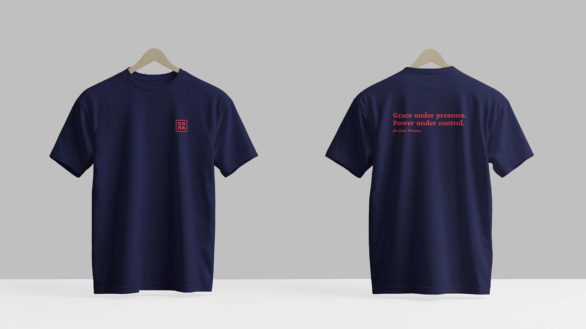
Created the full brand presentation, positioning, narrative, visual system, and applied the identity to real-world touchpoints: apparel, accessories, signage, and packaging. Showing not just what the brand looks like, but what it feels like to live with it.
Created the full brand presentation, positioning, narrative, visual system, and applied the identity to real-world touchpoints: apparel, accessories, signage, and packaging. Showing not just what the brand looks like, but what it feels like to live with it.
03. Creative Decisions
Every choice has a reason.
01
The Name & Its Meaning
ONNA (女) means "woman" in Japanese.
One word that bridges Portugal and Japan, honouring the cultural roots of Jiu-Jitsu
and the legacy of the Onna-Musha, warrior women who fought when the world expected silence.
One word that bridges Portugal and Japan, honouring the cultural roots of Jiu-Jitsu
and the legacy of the Onna-Musha, warrior women who fought when the world expected silence.
02
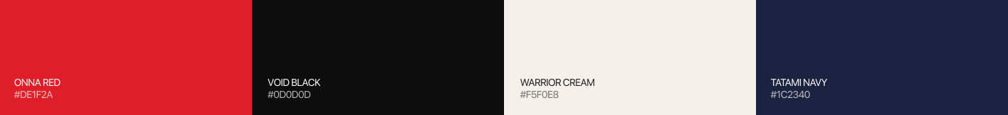
Red & Cream Palette
Red carries the weight of Japanese aesthetics, urgency, power, ceremony.
Cream grounds it with warmth and femininity without softness.
Together, they communicate strength that doesn't need to prove itself.
Cream grounds it with warmth and femininity without softness.
Together, they communicate strength that doesn't need to prove itself.
03
Oriental Typography
The typeface echoes the structural logic of Japanese calligraphy, bold, deliberate strokes with cultural resonance.
It carries weight on a kimono collar and presence on a storefront equally.
It carries weight on a kimono collar and presence on a storefront equally.
04. Visual System
Colour. Deliberate by design.
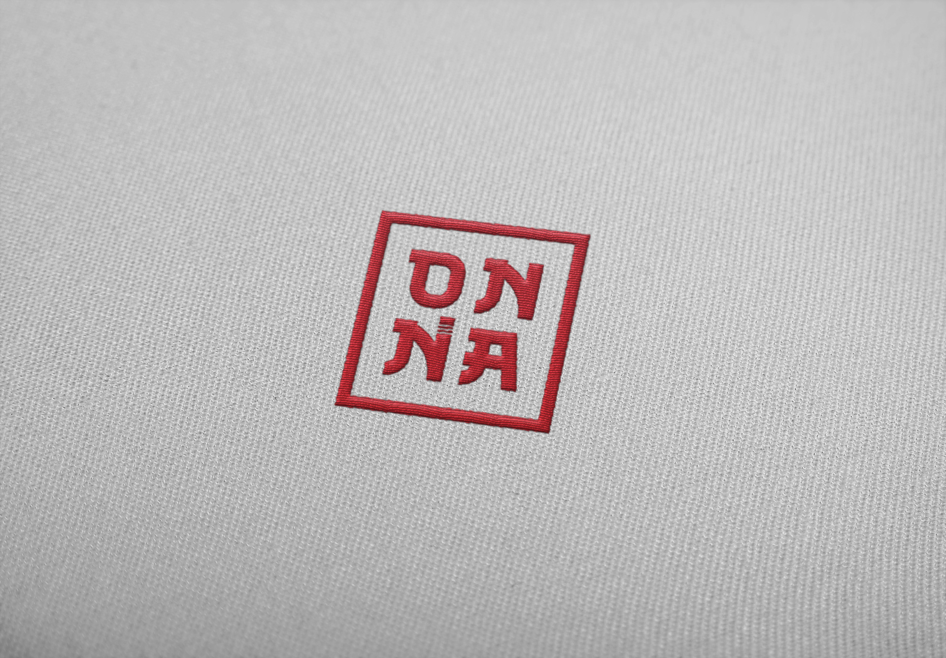
LOGO MARK


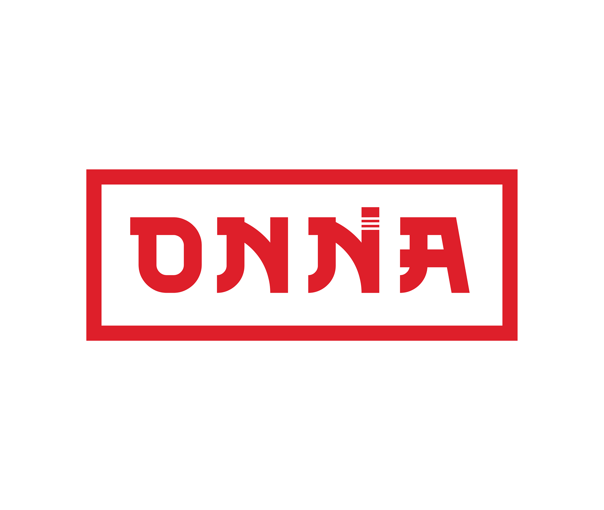

BRAND WORDMARK
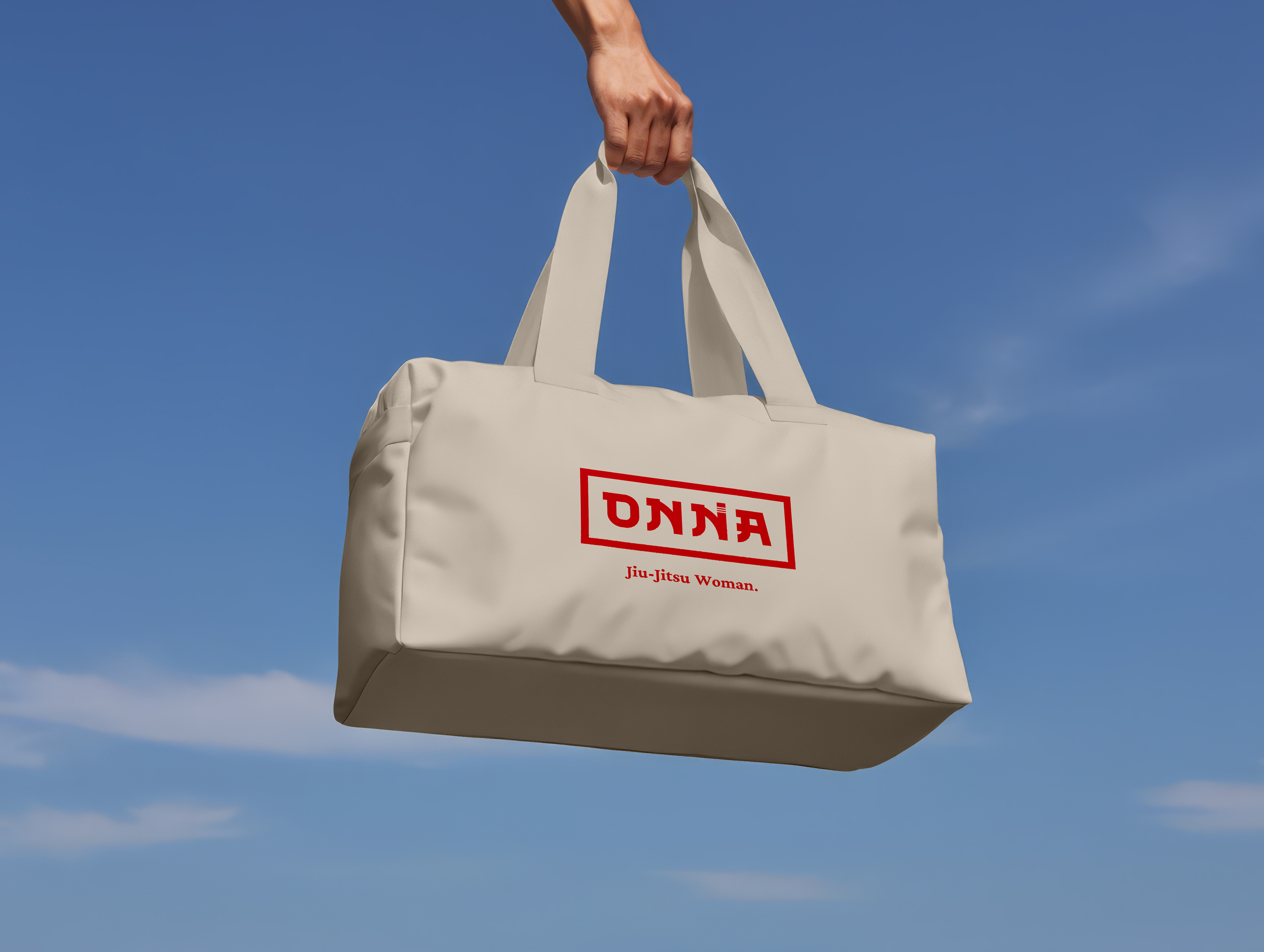
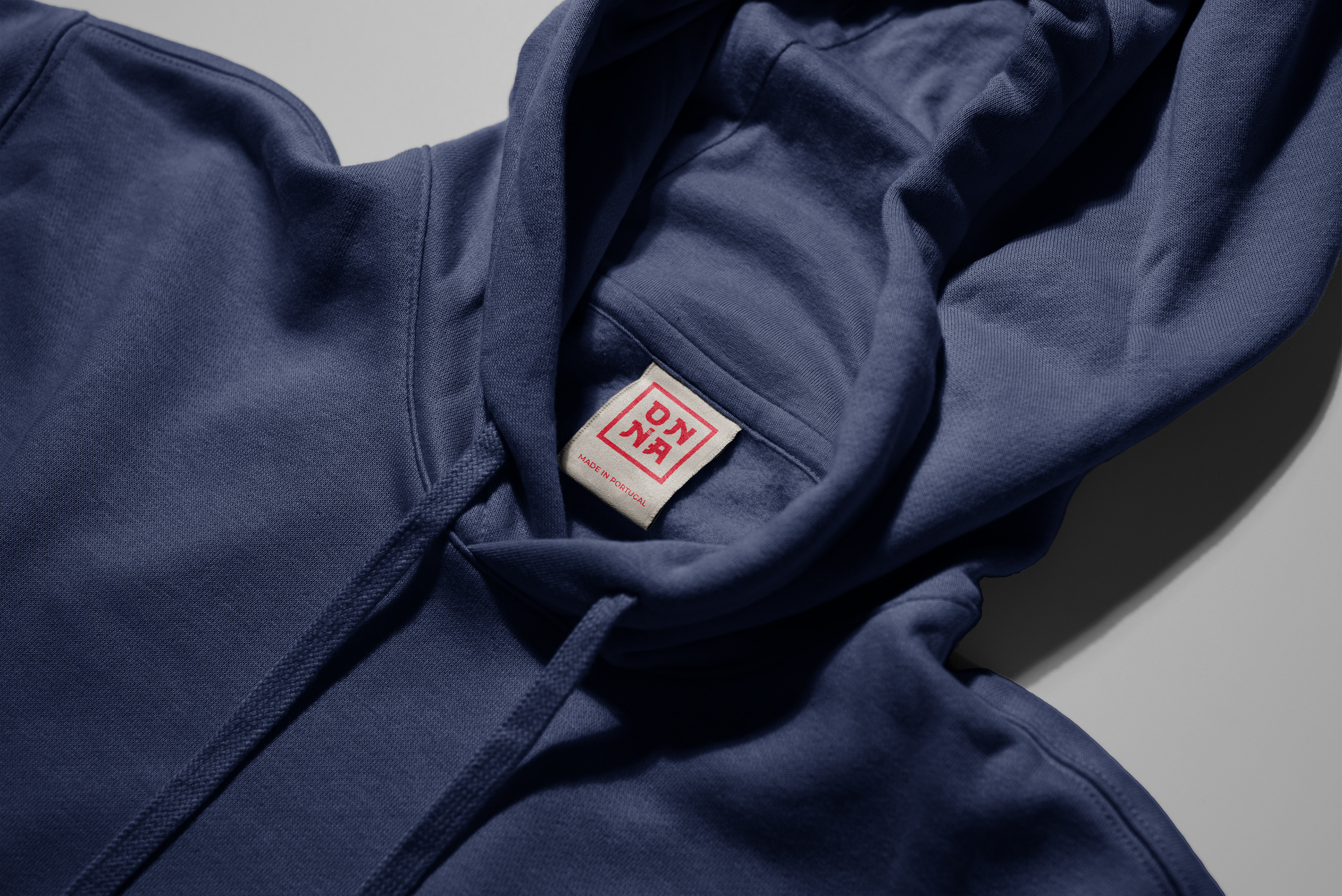
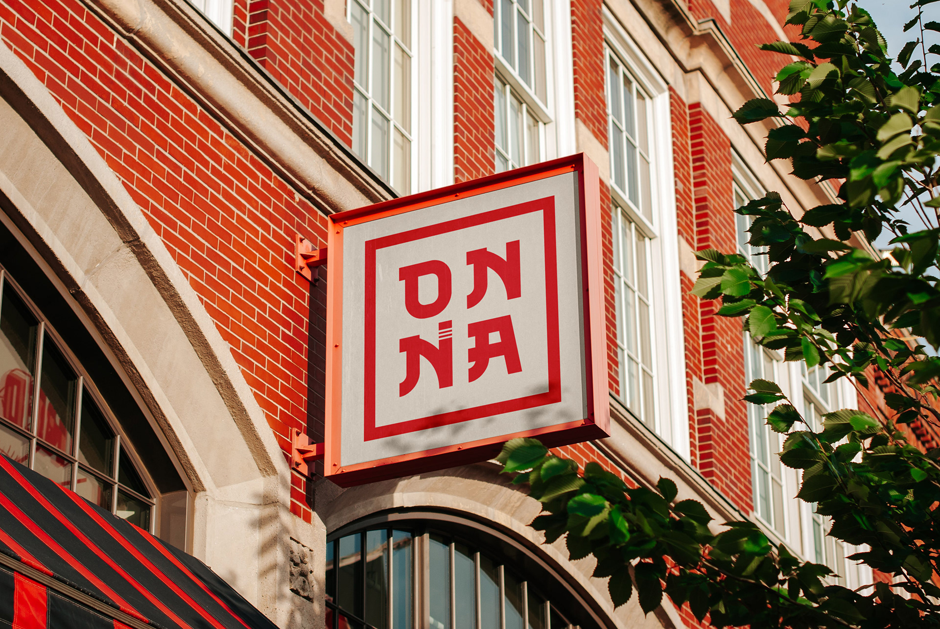
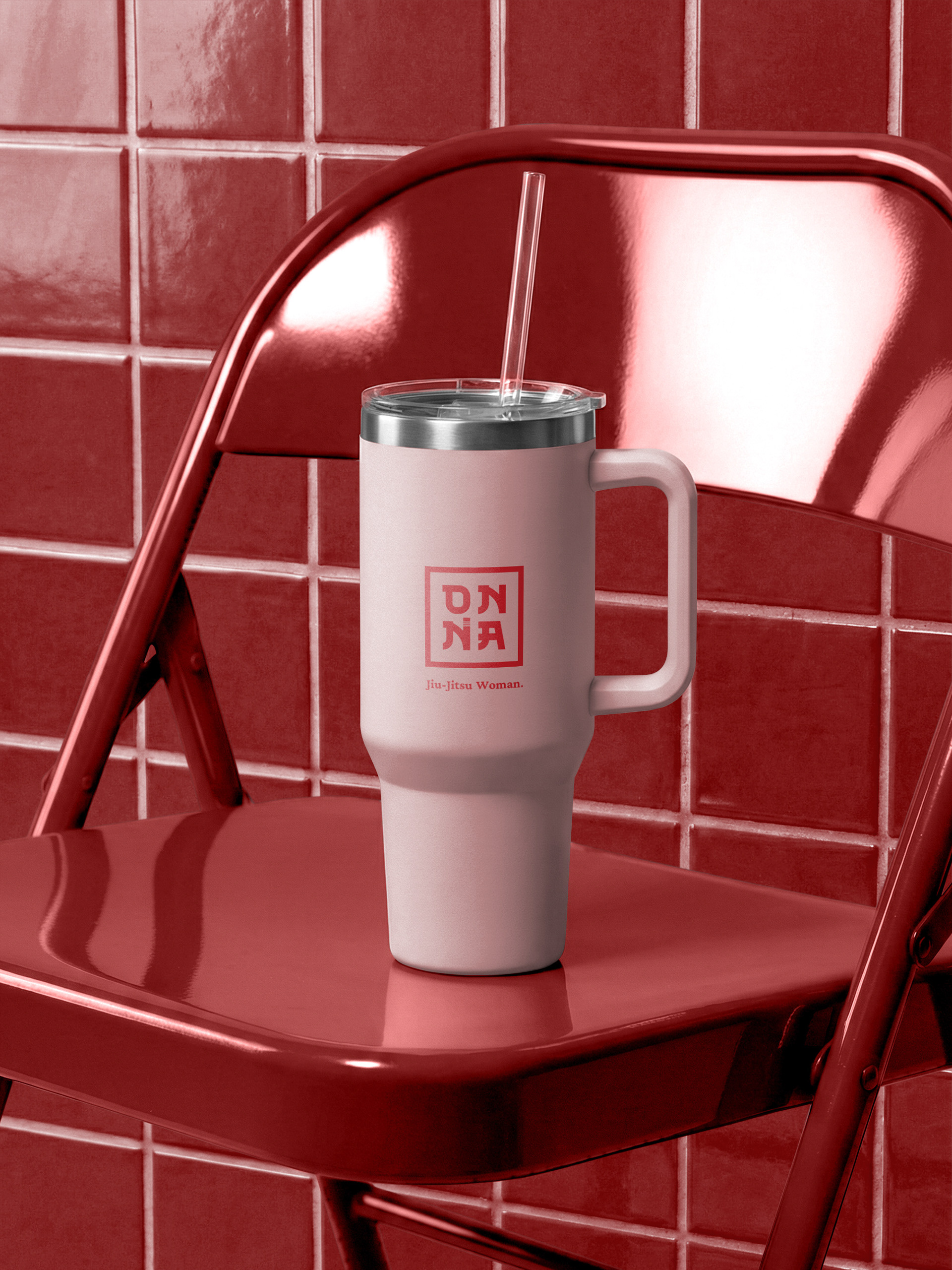
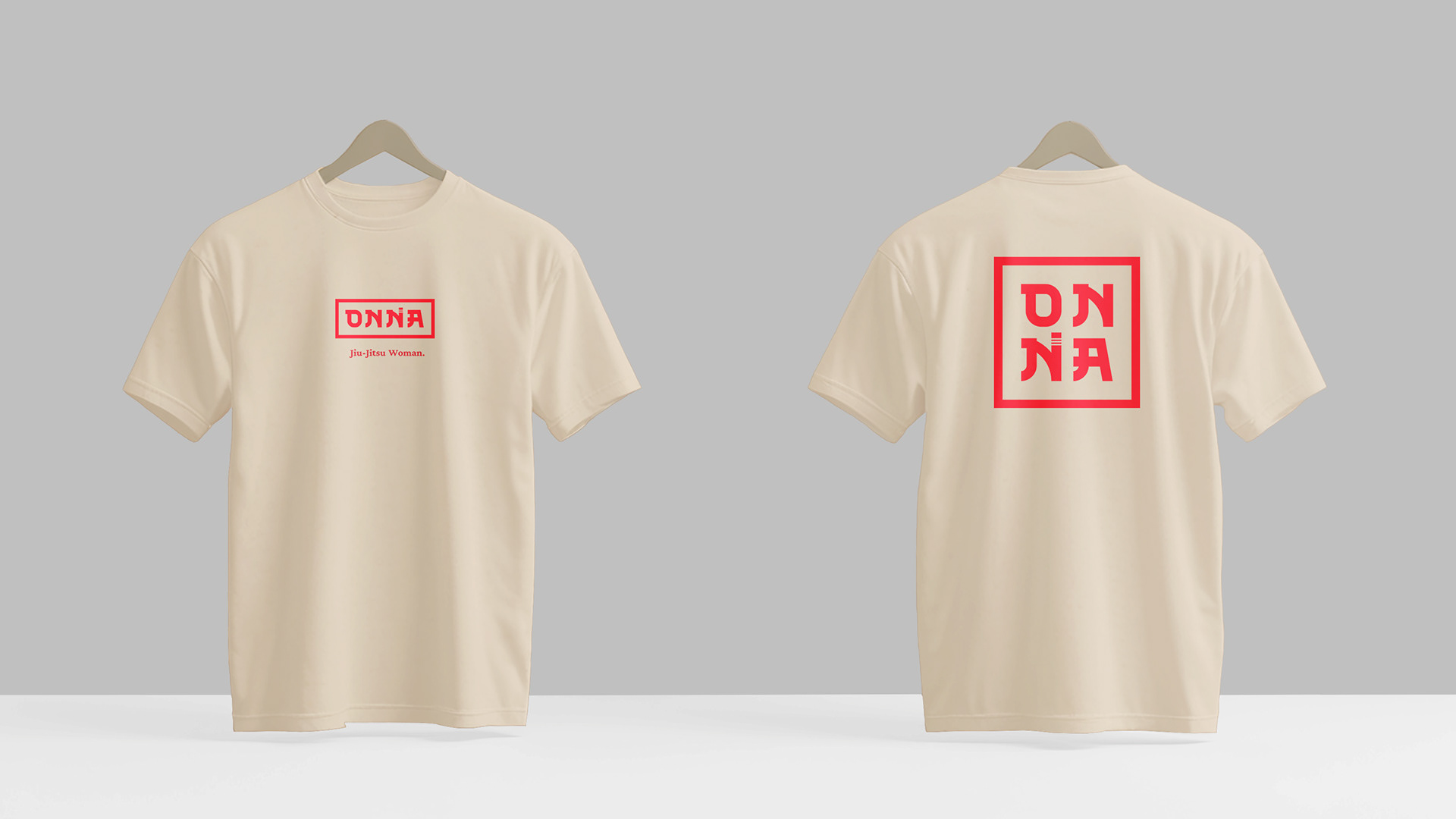
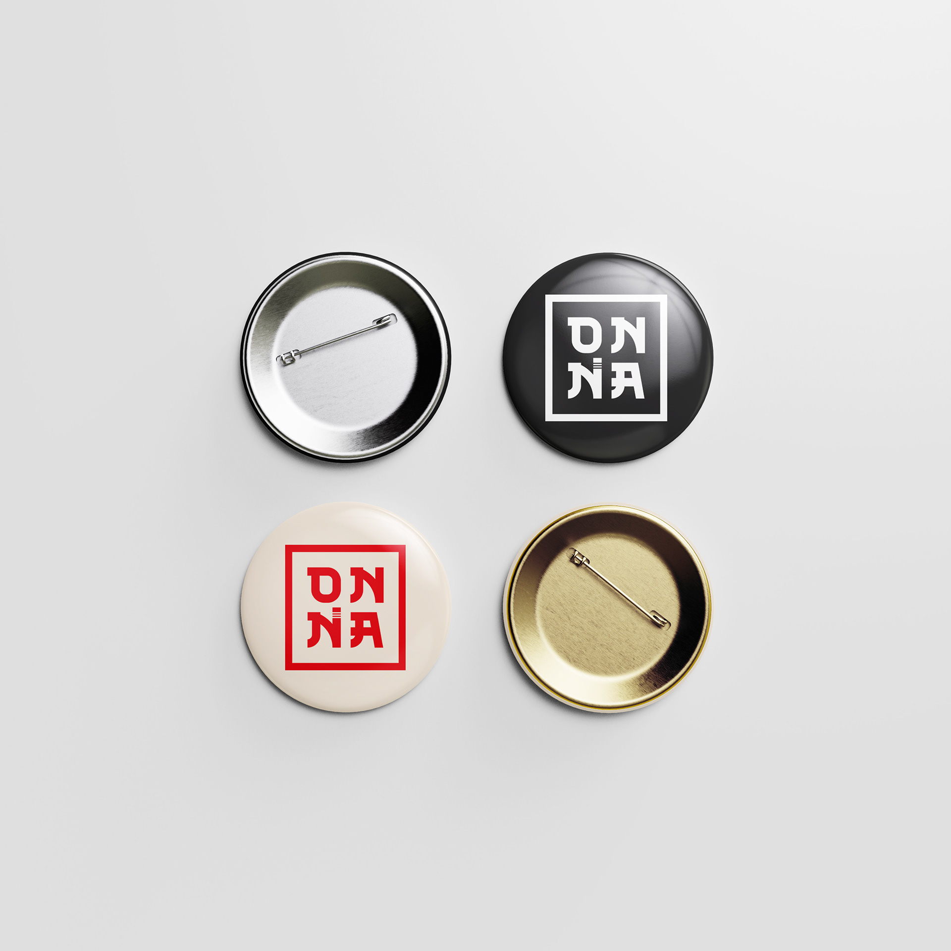
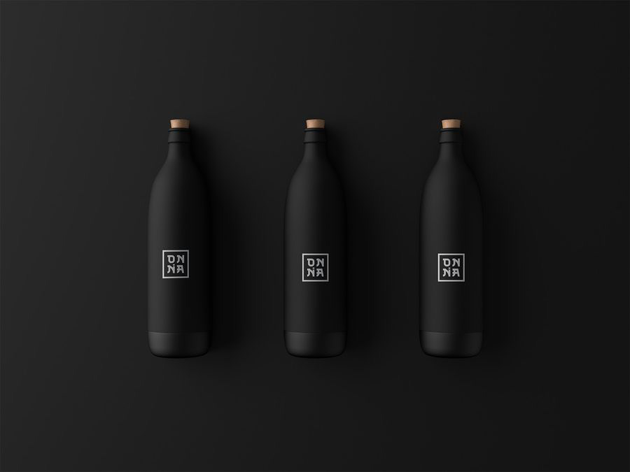
05. Touchpoints
A brand that lives beyond the mat.
The identity was applied across a full range of touchpoints, from training gear to lifestyle accessories,
proving its versatility and cohesion at every scale, from a pin badge to a building-side sign.
proving its versatility and cohesion at every scale, from a pin badge to a building-side sign.
06. Outcome
A brand that felt exactly right.
The client's response was immediate and clear: the identity was exactly what she had envisioned.
Logo, colour palette, brand presentation: everything landed. The brand is currently in the process of being officially registered before its public launch.
Logo, colour palette, brand presentation: everything landed. The brand is currently in the process of being officially registered before its public launch.
But beyond the client's approval, this project carried personal weight.
Designing ONNA as a woman who trains in Jiu-Jitsu meant creating something I genuinely believe in.
A brand that says to every woman stepping onto the mat: you belong here, and you are strong enough.
Designing ONNA as a woman who trains in Jiu-Jitsu meant creating something I genuinely believe in.
A brand that says to every woman stepping onto the mat: you belong here, and you are strong enough.
ONNA is more than a label. It is a statement that the protection Jiu-Jitsu builds in women:
the confidence, the discipline, the knowledge that you can defend yourself deserves a brand built with the same intention.
the confidence, the discipline, the knowledge that you can defend yourself deserves a brand built with the same intention.
"Fight. Rise. ONNA."